How To Make Your Website More Attractive And Enticing To Your Consumers
These four tips will make sure your targeted audience is still thinking about your website when they leave the site.
1. Your site should load fast:
How quickly your page loads is an important part of any website’s user experience and it is vital that we think about this even if it means making your site less aesthetically pleasing. Unfortunately, if the speed of a site is going to hinder their experience consumers care more about how fast a page is loading then the actual features of a site. While it is important to maintain an interactive site, you need to take into consideration the speed of all computers. For instance, one computer might load a page in 3 seconds while another might take 5 seconds. You don’t want to loose a potential customer because of loading time. According to webpronews.com 75% of people reported not wanting to return to a site if it took longer than 4 seconds to load.
Here you can learn how your loading time will affect your search engine results.
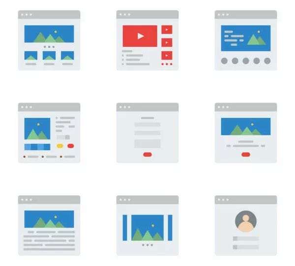
2. Make your website easy to navigate:
Your website needs to be simple, yet compelling. If the website visitor finds your site too confusing to go through they will often leave and go with a different product. While it is important to keep your site interesting, it is also important to make sure your visitor can clearly tell where they need to go. Here are 6 tips to make your navigation easier and one thing you can do with these is sit down with a friend and see if they understand your site after looking at the tips. You should see if they can easily navigate your site when looking for certain information such as how to contact you and what your company offers.
3. Use suitable colors and fonts:
This might seem like a simple guideline, but it is important to note what colors you are using because different colors mean different things. Some sites prefer to use analogous color schemes (colors right next to each other on the color wheel), while others prefer to use contemporary color schemes (colors opposite of each other on the color wheel). This article explains a few more schemes as well as few examples of the different schemes.
It is also important to note that certain fonts might not be the best idea. When working with older customers your font should be at least a 10-point size in order to make the site visible. Another tip is to use the Sans Serif Fonts because that family is typically easy to read on computers and electronic devices. An example of a font in the Sans Serif family is Arial or Helvetica. On this site you can read more about why fonts are important when creating a website as well.
This is an example of a monochromatic harmony scheme where there is only one color used and the point of this is to give off an expression of unity and elegance:
4. Don’t overuse Popups:
It is extremely important when creating and developing a website that your site does not bombard visitors with popups the whole time. A few is fine and encouraged, but when a consumer just wants to get to a certain point of information on your site they do not want to deal with popups constantly coming up. You can easily avoid this by watching your use of them.
See More Resource
- Website Performance Optimization Tips
https://www.websitebuilderexpert.com/building-websites/website-speed/
Learn how to enhance website speed for a better user experience. - 6 Website Navigation Best Practices
https://www.smashingmagazine.com/2009/03/10-principles-of-effective-web-design/
Tips for making your site easier to navigate and user-friendly. - Understanding Color Theory in Web Design
https://www.canva.com/colors/color-wheel/
Explore different color schemes and how they influence user perception. - Why Fonts Matter in Website Design
https://www.fonts.com/content/learning/fyti/why-typography-matters
Discover how font choice impacts readability and design aesthetics. - The Impact of Popups on User Experience
https://blog.hubspot.com/marketing/website-popup-best-practices
Best practices to avoid annoying users while still using effective popups. - Google’s Core Web Vitals Explained
https://web.dev/vitals/
Understand how loading time and interactivity affect your SEO. - Chicago Web Design for Business Growth
https://psycray.com/chicago-b2b-business-to-business-website-development/
Professional website solutions tailored for B2B businesses in Chicago. - Website Development for Local Businesses
https://psycray.com/website-development-for-chicago-businesses/
Custom web development that helps small businesses establish a strong online presence.